Custom dashboards
With tracezilla’s Power Pack you can create your own dashboard in combination with your own custom reports from Data Extracts. The dashboard is a visualization tool for setting up your reports as charts (bar, line, stacked bar, doughnut, pie), as well as regular report views where you can combine multiple reports into one dashboard.
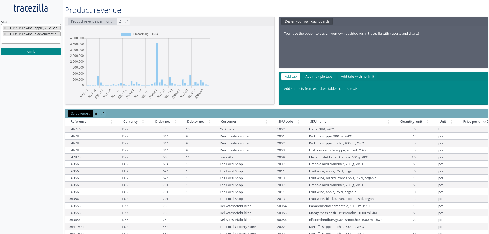
Example, a simple dashboard
Enable Custom Dashboards
Custom Dashboards is an extension that must enabled before use.
The extension is a part of an add-on pack. Read more about pricing and plans.
Go to Company Settings > Extensions. Find Custom Dashboards and click to enable.
You can now access the item Custom Dashboards in your Company settings.
Create custom dashboard
- Click the company name at the top right and select Company Settings.
- Click Custom Dashboards.
- Click Create dashboard.
- Enter a Title, which is the name of your dashboard.
- It is optional to add a description to the dashboard.
- You can choose whether you want to set up multiple layouts for different devices.
By default, the layout is intended for computers, but you can also set up a mobile or tablet layout.
- The dashboard is Active by default. You can deactivate it at a later time if you no longer want it to be used.
- Click Save.
Add panel
A panel contains the chart or report that you want to see in the dashboard. You specify how big the panel should be, i.e. how much space it takes up in the view.
- Click Add panel.
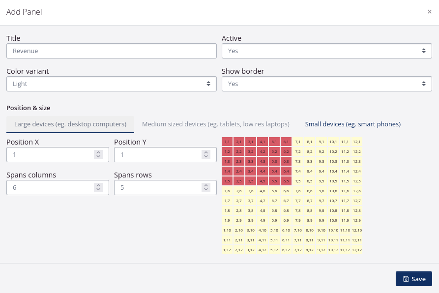
- Give the panel a name that reflects what the chart/report shows in the Title field.
- By default, the panel is Active. You can later deactivate it if it’s no longer relevant.
- Select a color for the background of the panel.
- Choose whether you want a border/frame on the panel.
- Specify the size of the panel using Position X and Y, as well as Span columns and rows.
- Click Save.
Add tab to the panel
- Click Add tab.
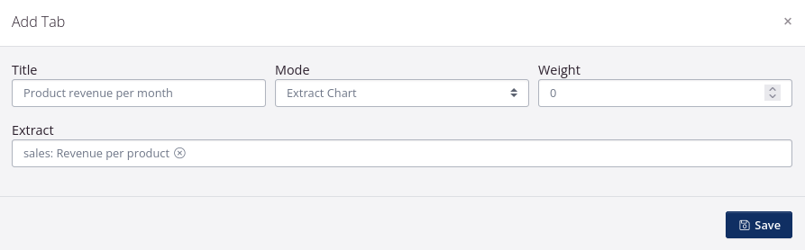
- Give the tab a name/title.
- Choose whether to add a chart (extract chart), text (text editor), a link to a publicly accessible page (URL) or a table (report in tabulated format).
- You may want to give the tab a Weight. If you add multiple tabs to the same panel, the weight will determine which tab is placed first in the view.
- Click Save.
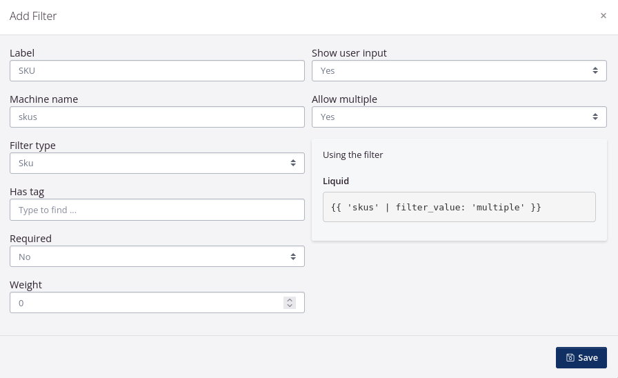
Add filter
A filter affects the displayed results in the dashboard. You can apply a filter to all charts and tables in the dashboard.
You can set up charts for sales, reports for inventory value, etc. and add a SKU filter or a filter where you can search for multiple SKUs.
You can add multiple filters to the same dashboard. For example, you can add a partner filter to filter customers, a SKU category filter to filter products, and a date filter to filter by a date range for sales order delivery.
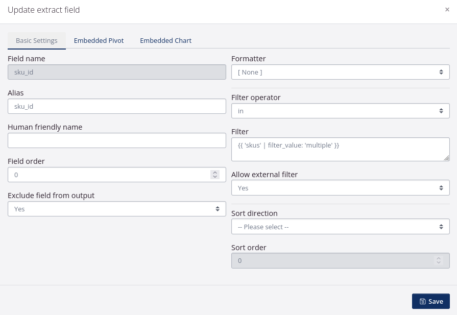
Once you have added the filter to the dashboard, simply copy the code from the filter and paste it into the relevant fields in the data extracts to which the filter is applied.
- Click the Filters tab.
- Click Add filter.
- Name the filter in the Label field.
- The machine name is automatically filled in with the same name you used for the label. You can overwrite the name.
The machine name is used for the code displayed under Using the filter: Liquid.
- Select a Filter type that matches the filter you would like to add.
- The next fields are responsive to the selected filter type.
- Click Save.
The charts and reports that the filter should have an effect on must have the filter added as well. This is done in the data extract on which the report/chart is based.
Below you can see an example of how the filter is added to a field in the data extract.